


展覽專刊
選擇以裸背線裝的方式來裝訂專刊呈現一種開放式的性質,書冊結合撕開穿越的視覺,呈現裡面所蘊含撕去並揉掉狹隘一切的精神。出走去找尋更多將其紀錄並展現。
-
Exhibition publication
We use exposed sewing to express our open-mind characteristics, We encourage the spirit of letting go of all obstacles and narrow things from the past and to keep them recorded with words or drawings in the sketchbook, so the book was designed with tearing out and departure.
邀請卡設計
從封套的裂口處拉出裡面的內卡,體會我們展覽的主軸與氛圍。撕開過往、揉掉框架邀請你一起出走,尋找更多可能、體會實現夢想的過程。
-
Invitation design
When you pull out the inner card from the envelope you can experience the main ideas and atmosphere of our exhibition. Tearing up the past and think out of box. We invite you to depart from your fetters and find more possibilities and experience the process when achieving the goal.
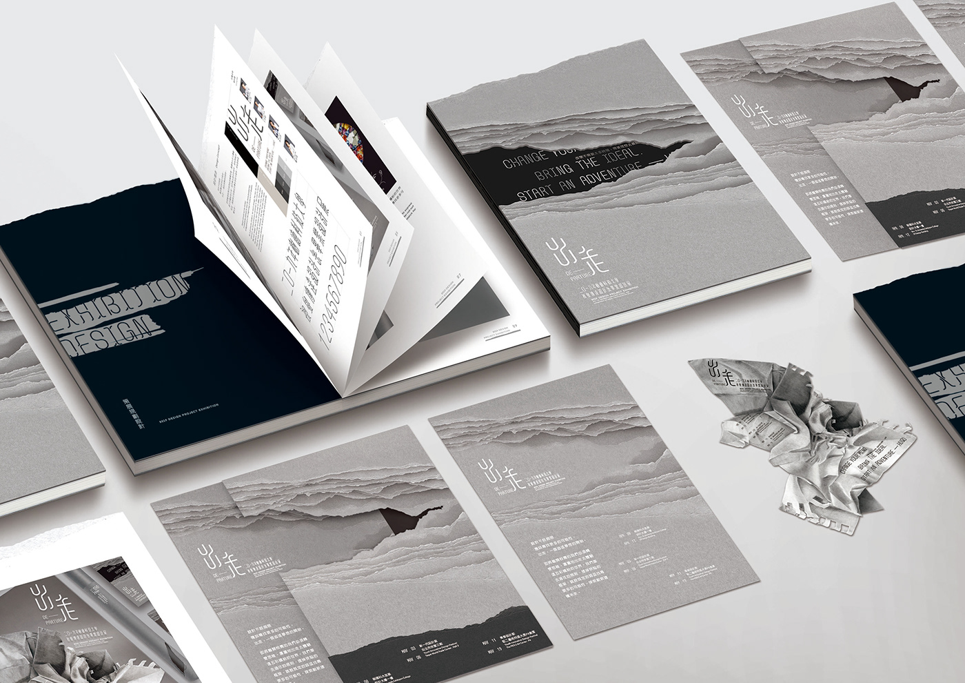


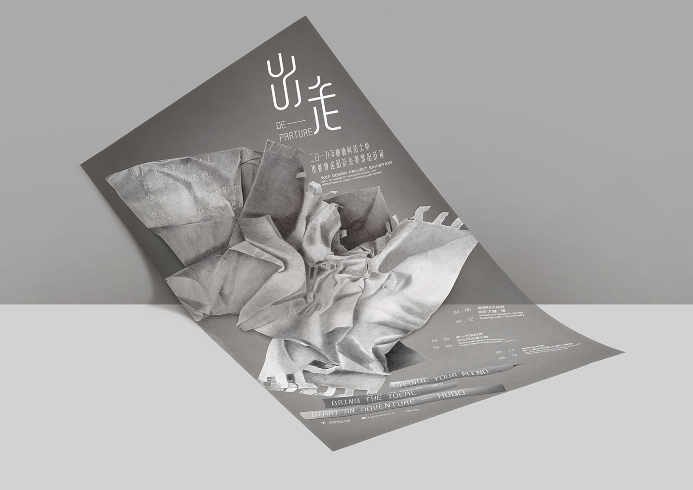
海報設計
以學生時期的筆記本作為發想,裡面記錄著學生時期的日程、想法、草圖等成長的歷程。過程中會有撕掉更改的痕跡,象徵著推翻一部份的自我、體悟並革新創造出新的思維。
視覺中以一張撕去揉掉並丟棄在半空中的紙團,象徵著撕去學生時期的一頁撕去框架、揉掉狹義出走探索創新、建構未來,並以灰階素描的手法表現出
一切在最初始得氛圍,思想的誕生、設計的開始。
-
Poster design
The main concept is the student's sketch, which records the growth of the student's agenda, ideas, sketches, etc. There will be traces of tearing up the changes in the process, symbolizing the overthrow of a part of the self, understanding, and innovation to create new thinking.
In the poster, a piece of paper that is torn off and discarded in the air symbolizes the tearing of a page of the student's period to tear away the frame, smashing out the narrow sense of departure, exploring and innovating, constructing the future, and expressing it in the sketch. Everything is at the beginning of the atmosphere, the birth of ideas, the beginning of the design.


海報筒
海報筒與萬花筒做結合呼應我們將體會這五彩繽紛的世界,讓海報筒不只是裝載著海報,放眼看去學習,尋找更多可能的未來。
-
The poster roll design is based on a kaleidoscope to express the colorful and magical world, and so that the poster roll not only carries poster but also the possibilities we can search for in the future.

展場設計
以開放式的設計營造寬敞、明亮的空間來陳列各組的作品,並以黑灰白之簡約色調來營造整體氛圍呼應出走的視覺形象,並以簡約的幾何形妝點櫃檯來與主視覺做呼應。
-
Exhibition Design
We use an open-style idea to design our exhibition booth and use it to display all our designs and products, then we use easy colors based on black, grey and white to synchronize with the visual effect of our theme “Departure”, finally we use simple geometry to decorate our booth so it responds to the main visual concept.


視覺統籌 | 黃士銘 Huang, Shih-Ming
展覽規劃 | 王昱超 Wang, Yu-Chao
文案撰寫 | 林玟妤 Lin,Wen-Yu
專案企劃 | 夏詩涵 Xia,Shih-Han
2019 樹德科技大學視覺傳達設計系畢業展 視覺形象設計
Thank you !


